Previously in these posts, I shared a little bit about our invitations. Now, it's time to let you all in the details behind our invitation suite and the lessons that I learned along the way as they were crafted. And, of course, some pretty pictures to display along the way!
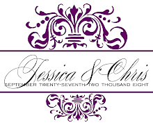
After scouring blogs and websites for invitation inspiration, I kept feeling that I was coming up empty-handed. After dozens of invitation drafts, I still didn't have an invitation that was juuuust right. However, once Erin from lucky designs sent over our monogram , I finally had a vision for our invitations {and the rest of our wedding, for that matter}.
Our invitations were wrapped in 1.5 inch raspberry {wine} satin ribbon affixed with our monogram square.
Our invitations were wrapped in 1.5 inch raspberry {wine} satin ribbon affixed with our monogram square.

The ribbon slid off easily, revealing our lovely invitation:

The invitation itself was affixed to a plum pocket, which held our four insert cards.

Our four insert cards included an RSVP card, a Reception card, an Accommodations card and a card stating directions to venues on one side and a map of the city on the other.

Lessons Learned #20: I bought the ribbon at save-on-crafts. 50 yards of 1.5 inch thick ribbon was only $6.99+ shipping. Go here to see their selection of ribbon to see if your colors are available!
Lessons Learned #21: April from April Foster Events is a registered vendor of various paper companies. I was able to purchase the plum pockets thru her for an incredibly affordable price. The pockets are one-sided so I was able to affix the invitation to the flat side of the pocket {with double sided tape} and store our insert cards in the pocket.
Lessons Learned #22: About a foot of ribbon was needed to make the ribbon band that fit around our {5x7} invitation/pocket. I overlapped the ribbon slightly and used double sided tape to adhere the ribbon to itself. Then I attached our monogram 2x2 inch square to the ribbon with double sided tape where the ribbon overlapped, in order to hide the overlap. I then slid on the ribbon over the pocket/invitation so that the monogram square was over the center of the invitation.
Lessons Learned #23: The map was created by taking a screen shot of the map of Indianapolis from mapquest.com. Then, using powerpoint we opened up the map screen shot and traced the map using the powerpoint drawing tools. The mapquest map was then deleted, leaving only our tracings. We used text boxes to add in the text and Chris {somehow} created little interstate signs. I found tutorials on weddingbee extremely helpful. You can find them here and here and here.
Lessons Learned #24: I could not have successfully designed our invitations without the help of April from April Foster Events. I literally would have torn my hair out. April was a dream to work with and I would recommend her to anyone. You can reach her at hello@aprilfosterevents.com and if you choose to work with her, please let her know that I recommended her!
previously in the series, "how i tied the knot": getting ready, our first look, bouquets and boutonnieres, socks and shoes, bubbles and getting away, the cake, thank you cards, blurb guest book, outside the mansion, the dress
all pictures by: tying the knot. please link back to tying the knot when posting any of these pictures.
all pictures by: tying the knot. please link back to tying the knot when posting any of these pictures.


 Knowing me, one draft is never enough and there is one change that I am debating: the wording of the "response."